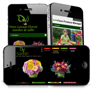
Responsive Web Design – Garden Center Responsive Web Design
Garden Center News websites are beautiful and colorful sites. In 2012-2013 we designed a lot of website for Desktop and Laptop viewers. Websites have changed due to technology. Customers prefer their Websites open in mobile and tablet devices. These sites require faster loading and perfect viewable sites.
Responsive Web Design approach aimed at crafting sites to provide an optimal viewing experience easy reading and navigation with a minimum of resizing, panning, and scrolling-across a wide range of devices (from mobile phones to desktop computer monitors).
A site designed with RWD adapts the layout to the viewing environment by using fluid, proportion-based grids, flexible images, and CSS3 media queries, an extension of the @media rule.
The fluid grid concept calls for page element sizing to be in relative units like percentages, rather than absolute units like pixels or points. Flexible images are also seized in relative units, so as to prevent them from displaying outside their containing element. Media queries allow the page to use different CSS style rules based on characteristics of the device the site is being displayed on, most commonly the width of the browser.

